


Moodlog
End to end design • 4 weeks/80 hours
Moodlog is an app for tracking one’s mood through journaling, which can be done in multiple ways: by typing, recording voice memos, drawing/doodling, or uploading a photo. It also gives an option to choose a color associated with someone’s mood; thus, each entry will indicate a different emotional state. There’s also a meditation library of quick guided audio meditations, as well as a journal prompt for the day.
The problem I was solving was improving and maintaining the user’s mental health and well-being by finding an unobtrusive and gentle way to do so through a mobile product. For many users, it's important to take care of their mental health in general, but also, specific users I’ve interviewed expressed interest in having a mobile outlet to do so while being on the go—when walking, running, or traveling.

Introduction


Our users are individuals aged 25-35 years old, limited to the middle-income bracket, and tech-savvy. They have an active and busy lifestyle, which makes them curious about different ways to decompress and look after themselves.
Research
To conduct research, I did a competitive analysis exploring different journaling and mood tracking apps on the market, such as Sensa, Day One and Clarity as well as iPhone’s Notes app and non-digital options such as physical journals.
I also conducted in-person and remote interviews with potential users. The interview questions I posed were the following:
- Tell me about your hobbies. Are any of them creative? How/when do you tend to do them?
- Tell me about the self-care habits you practice. What’s (not) working/missing?
- Tell me about your morning/nighttime self-care routine.
- What do you do when you’re feeling stressed/sad/happy? On a tough/good day?
- In what instances do you write down how you feel/your thoughts?
- In what instances do you use the Notes app/the Voice Memo app?
- When was the last time you journaled/drew/colored/sent a voice memo to a friend?
- What do you think could help people stay consistent with their self-care habits in general?
The project started off as a journaling product, which was definitely jumping to the solution too soon, but with the research and the user’s feedback, it transformed into the service focused on the user’s general mood and well-being while still having journaling as one of the features.
Define
Interviewees gave me a lot of insights regarding potential features to implement, as well as some ideas on how to make the product appealing for consistent use (such as tracking most frequently mentioned words in journal entries and others).
Most users preferred a mobile app that could be used 24/7, and others wanted a desktop site because they did not prefer mobile devices at all. A responsive website would appeal to both groups of people.
I can't assume and suggest everyone should use the product since it’s a sensitive subject, and people have their approaches towards it. This gave me an idea to frame the service in a lighthearted and approachable way.
I learned that participants rarely return to read their journal entries and reflect on them, but find it valuable when they do. So, I thought, how might we find an engaging way to interact and reflect on what they wrote?
Here's how I organized the research findings through a card-sorting exercise.

I created user and task flows based on this exercise as well.

Design
I started off the design process by creating a mood board out of references that would match the brand’s ethos and concept.

Then, using the mood board, I came up with a color palette that consists of different hues associated with emotions and feelings. I made sure the logo and other design elements also matched the overall stylistic tone.

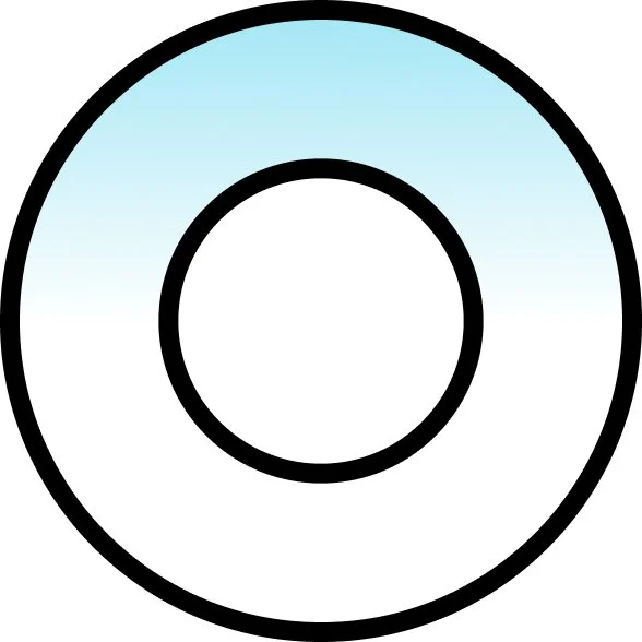
Perhaps the most signature design element of this project, which is also a functional element, is the color wheel.

By moving the arrow around the wheel, it allows users to choose the color that best describes their mood that day. I also used the mini version of the wheel throughout the introductory section of the app to make the design more cohesive.
Wireframes


Visuals
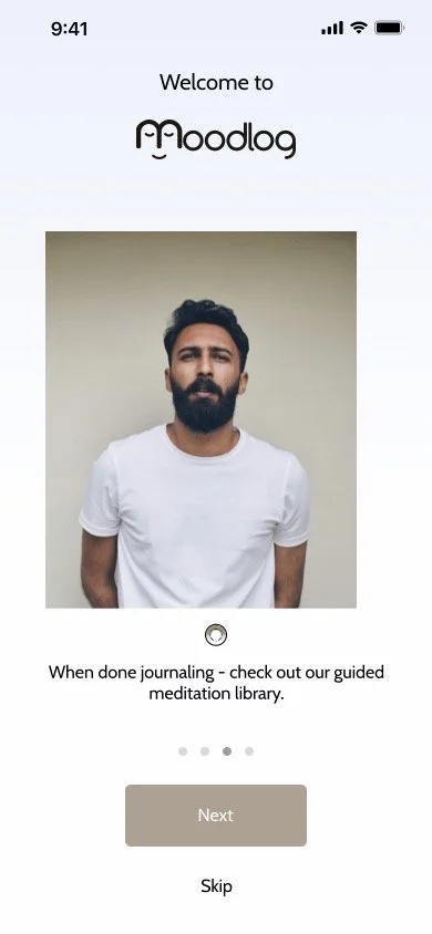
Welcome page

Sign up/Log in


Homepage

Journal entry input options

Menu

Calendar page


Meditation library


Testing
Usability testing participants were asked to complete the following tasks:
Signing up for the product on its landing page
Creating a journal entry
The general goals of the usability testing were also to gather feedback from users regarding their experience with the product and to ensure that the landing and main pages of the product are easy to navigate.
Results:
Success rate: 100%
The general feedback on the product was very positive.
The aspects of the product that created difficulty and confusion during task flows were altered after the testing.
Conclusion
To conclude, I can say that the biggest lesson for me while working on this project was overcoming my own personal bias to avoid jumping into solutions without doing the research.
My favorite part of the process was coming up with the brand identity and developing the style tile.
Overall, I’m happy with this project and the feedback I got from it, and its potential to help the user and also enrich their daily life.